
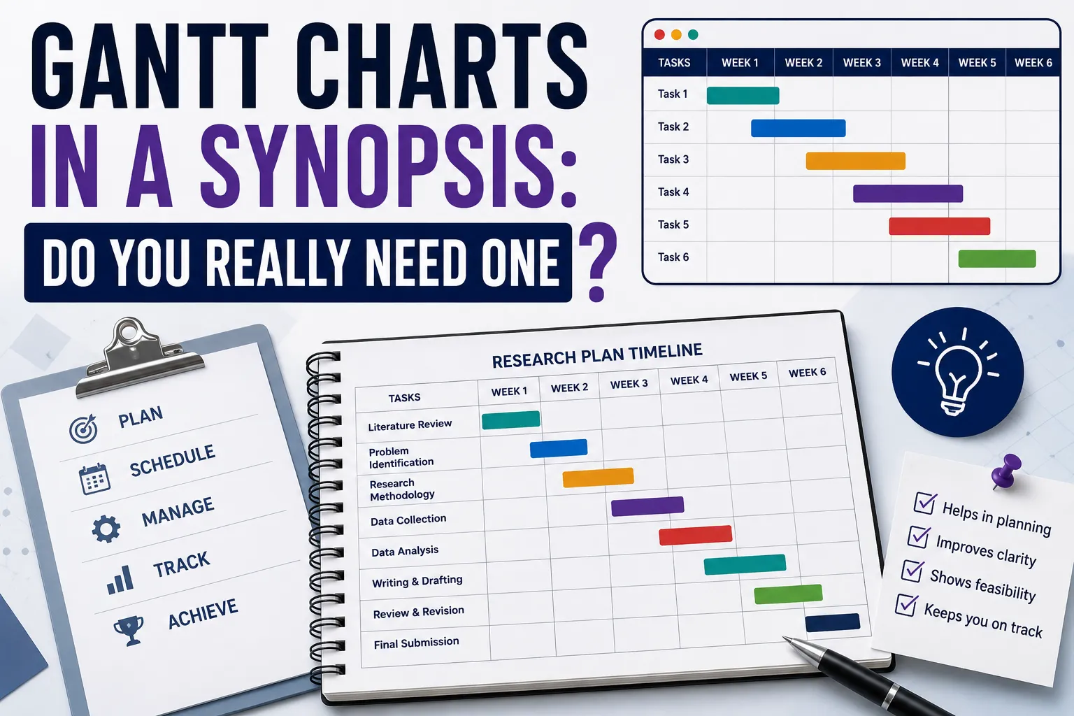
Somewhere in the final stretch of writing a synopsis, a scholar usually pauses on one small, oddly stressful question: do I actually need a Gantt chart in here, or is a written paragraph about my timeline enough? It's a small section relative to the rest of the document, but it draws a surprising amount of anxiety — partly because it feels like a "project management" skill unrelated to actual research, and partly because nobody's ever clearly explained when it's expected versus optional.
This guide answers gantt charts in a synopsis: do you really need one the way an experienced research supervisor would — directly, with the actual reasoning behind when a Gantt chart earns its place and when a simpler timeline description does the same job just as well. If you're a first-time PhD thesis writer without a strong research background, this is written specifically for you.
At ThesisLikho, our PhD-qualified mentors have guided more than 10,000 scholars through synopsis writing, timeline planning, and Doctoral Research Committee presentations across disciplines. What follows draws on that mentoring experience, checked against current guidance on PhD research planning and timeline documentation used across Indian and international universities.
1. The Short Answer
Yes, in most cases — but not because a Gantt chart is inherently more rigorous than a well-written paragraph. You need one primarily because many Indian and international universities explicitly require a visual project timeline as part of the PhD synopsis or research proposal, specifically to demonstrate that you've thought through your project's phases, their sequencing, and a realistic completion timeline. Where your specific university's format guidelines don't explicitly require one, a Gantt chart is still often the clearer, faster way to communicate a multi-phase research timeline to a Committee that's skimming dozens of these documents — but a genuinely well-structured written timeline, in those cases, can serve the same purpose.
The rest of this guide walks through exactly when the chart earns its place, when it doesn't, and how to build one that actually helps your case rather than just checking a formatting box.
2. What a Gantt Chart Actually Is and What It's Meant to Communicate
A Gantt chart is a project management tool that graphically illustrates a schedule of tasks or phases over time, using horizontal bars to show when each activity begins, how long it runs, and — in more detailed versions — how different tasks depend on or overlap with one another. Originally developed for industrial and engineering project planning, it's since become a standard planning tool across academic research as well, precisely because a multi-year PhD genuinely functions like a long, multi-phase project with real dependencies between stages.
In a synopsis specifically, the Gantt chart's job isn't to prove you're a skilled project manager — it's to demonstrate that you understand the actual shape and sequencing of your proposed research: that literature review realistically precedes data collection, that data collection realistically precedes analysis, that your writing phase has been given genuine time rather than being squeezed into an unrealistic final few weeks, and that your total plan fits within your programme's expected duration.
3. Why Universities Ask for One in the First Place
Many academic institutions require a Gantt chart, or an equivalent visual timeline, as part of a research proposal specifically to demonstrate that the student intends to finish the project on time and has made a logical, sequenced plan for doing so. From a Doctoral Research Committee's perspective, this section is answering a fairly practical question that the rest of the synopsis doesn't directly address: given everything you've proposed — the literature review, the methodology, the data collection, the analysis — is this actually completable within your programme's timeframe, or is the scope quietly larger than what a PhD tenure realistically allows?
This is also why the requirement tends to be stricter and more explicit in STEM and applied research fields, where multi-year lab work, fieldwork, or data collection phases carry real scheduling risk, and comparatively more flexible in humanities or purely theoretical work, where the research process is less naturally divided into sequential, schedulable phases.
4. When a Gantt Chart Genuinely Adds Value to Your Synopsis
A Gantt chart earns its place, beyond simply satisfying a formatting requirement, in a few specific situations:
- Your research has multiple genuinely parallel or overlapping phases — for instance, ongoing literature review continuing alongside early data collection, or preliminary analysis beginning before all data collection concludes. A written paragraph struggles to communicate this kind of overlap clearly; a visual timeline does it instantly.
- Your research depends on external approvals or access windows — ethics committee clearance, seasonal data collection constraints, access to a specific facility or population during a limited window. Visualizing these dependencies against your other phases makes it immediately clear whether your plan genuinely accounts for them.
- Your programme spans multiple years with distinct milestone gates — coursework, comprehensive exams, proposal defense, data collection, thesis writing, and final defense, each with fixed timing constraints your university enforces. A Gantt chart makes the full multi-year shape of this journey easy to grasp at a glance, in a way a dense paragraph of dates doesn't.
- Your Committee or university format guidelines explicitly request one. This is, in practice, the most common and decisive reason — when the requirement is explicit, the value of the chart genuinely adding clarity becomes somewhat secondary to simply complying with a stated formatting expectation.
5. When a Written Timeline Description Is Just as Effective
A Gantt chart isn't universally necessary, and forcing one into a synopsis where it doesn't naturally fit can occasionally do more harm than good — a needlessly cluttered chart with too many granular tasks is often less clear than a well-organized paragraph.
A written timeline description can work just as well when:
- Your research has a simpler, largely linear structure — literature review, then a single data collection phase, then analysis, then writing — without meaningful overlap or complex dependencies between stages.
- Your university's format guidelines don't specifically request a visual chart, and instead simply ask for a "proposed timeline" or "research plan," leaving the format open.
- Your discipline's research process doesn't divide naturally into discrete, schedulable phases — some theoretical or humanities-oriented research genuinely resists being chopped into the kind of clean sequential bars a Gantt chart implies, and forcing that structure onto genuinely iterative, non-linear research can actually misrepresent how the work will unfold.
In these cases, a clearly structured paragraph or a simple year-by-year or semester-by-semester bulleted breakdown communicates the same information the Committee actually needs — completability within your programme's timeframe — without adding visual complexity that isn't earning its place.
6. What a Well-Built PhD Synopsis Gantt Chart Actually Contains
Whether hand-drawn, built in Excel, or generated through a dedicated planning tool, an effective synopsis-level Gantt chart typically includes a fairly consistent set of phases, adapted to your specific research:
- Literature review and research design finalization — typically an early, sometimes ongoing phase.
- Methodology development and, where applicable, instrument design or pilot testing.
- Ethics or institutional approval, where your research requires it — worth showing as a distinct phase given how often approval timelines are underestimated.
- Data collection or experimental/fieldwork phase — often the single largest block, and the one most worth breaking into sub-phases if it spans multiple stages or locations.
- Data analysis.
- Thesis writing, ideally shown as a phase with real, non-trivial duration rather than compressed into the final few weeks.
- Revision, formatting, and submission, including buffer time — a detail scholars very commonly under-allocate.
Each phase should show a realistic start and end point, and where genuinely relevant, should indicate overlap with adjacent phases rather than implying every stage happens in strict, non-overlapping sequence when that isn't actually how the work will unfold.
7. How to Build One Without Overcomplicating It
You don't need specialized project management software to produce a synopsis-appropriate Gantt chart — a well-organized spreadsheet is entirely sufficient at this stage, and several free templates and simple chart-building tools exist specifically for PhD-style research timelines if you'd rather not build the visual structure from scratch.
A practical build process:
- List every major deliverable and phase your synopsis has already described in its methodology and chapterization sections — the Gantt chart should visually represent commitments you've already made elsewhere in the document, not introduce new, undiscussed phases.
- Assign a realistic start and end point to each phase, checking this against your university's actual programme duration and any fixed milestone dates (coursework completion, proposal defense, comprehensive exams) it enforces.
- Mark genuine overlaps explicitly, rather than defaulting to a clean, fully sequential structure that may not reflect how the research will actually unfold.
- Build in buffer time, particularly around ethics approval, data access, and the final writing-and-revision phase — these are the stages most commonly and most severely underestimated.
- Keep the level of granularity appropriate to a synopsis, not a detailed operational plan — monthly or quarterly blocks are usually sufficient; a synopsis-stage Gantt chart doesn't need week-by-week task tracking, which is better suited to your own personal working plan than to the document a Committee is evaluating.
8. Common Gantt Chart Mistakes in Synopsis Submissions
- An unrealistically compressed writing phase — squeezing thesis writing into the final month or two after a chart otherwise spans years, which reads as an afterthought rather than a genuinely planned phase.
- No buffer time anywhere in the chart — a plan with zero slack for delays (a common and expected reality in research) signals inexperience rather than confidence.
- Overly granular task breakdowns that clutter the visual and obscure the actual high-level structure a Committee needs to assess.
- A chart that doesn't match the phases described elsewhere in the synopsis — if your methodology section describes three distinct data collection phases but your Gantt chart shows only one block, the mismatch is an easy, avoidable inconsistency for a careful reader to catch.
- Ignoring your university's actual milestone gates — building a generic timeline rather than one that accounts for your specific programme's coursework duration, comprehensive exam timing, or mandatory proposal defense date.
- Treating the chart as a formality finished in ten minutes, rather than as a genuine planning exercise — scholars who build their timeline carelessly often discover, months later, that the actual pacing of their research doesn't match what they submitted, which can complicate later progress reviews.
9. Alternatives and Supplements to a Traditional Gantt Chart
If a full Gantt chart genuinely doesn't suit your specific research shape, a few reasonable alternatives or supplements exist:
- A simple phase table, listing each phase alongside its expected start and end period, without the full visual bar-chart structure — communicates similar information with less visual complexity for a simpler, more linear project.
- A milestone list with target dates, particularly useful alongside a Gantt chart (rather than instead of one) to highlight the specific fixed gates — proposal defense, ethics approval, data collection completion — your Committee will most want to track.
- A narrative timeline paragraph, appropriate when your university's guidelines are genuinely flexible about format and your research doesn't have complex overlapping phases worth visualizing.
Where your specific university's synopsis format explicitly requires a Gantt chart, though, none of these alternatives should be substituted without confirming that's acceptable — check your department's specific guidelines directly rather than assuming a written equivalent will be accepted.
10. Practical Tools for Building One
You genuinely don't need specialized project management software for a synopsis-level chart, and reaching for something overly sophisticated can actually work against you — a chart built in an unfamiliar tool that you can't easily update later is less useful than a simple one you'll actually revisit as your research progresses.
- Microsoft Excel or Google Sheets — the most common and entirely sufficient choice for a synopsis-stage chart; a simple bar-per-phase structure built with conditional formatting or stacked bar charts covers everything a Committee needs to see, and it's a format nearly every supervisor can open and comment on without friction.
- Free dedicated Gantt tools — several lightweight, no-signup web tools exist specifically for building academic research timelines quickly, useful if you'd rather not construct the visual structure manually in a spreadsheet.
- Microsoft Project or dedicated project management software — genuinely more capability than a synopsis typically needs; this level of tooling makes more sense for your own personal, detailed working plan across your full PhD tenure than for the summary version included in your synopsis document.
- Hand-drawn or simply formatted charts — still entirely acceptable at synopsis stage, provided the phases, timeframes, and any genuine overlaps are clearly and legibly represented; the tool matters far less than whether the chart honestly reflects your actual research plan.
Whichever tool you use, keep the source file editable and accessible to you beyond just the synopsis submission — many scholars find their original Gantt chart useful to revisit and update as an actual working planning document throughout their PhD, not just as a one-time document to satisfy a formatting requirement.
11. How to Decide for Your Specific Synopsis
A short, practical decision sequence: first, check your university's synopsis format guidelines directly — if a Gantt chart or visual timeline is explicitly required, that settles the question regardless of your research's specific shape. If the requirement is genuinely open-ended, assess your research's actual structure — multiple overlapping phases, external approval dependencies, or a multi-year timeline with fixed institutional milestones all favor a visual chart; a simpler, largely linear research process favors a written or tabular alternative. When genuinely uncertain, default to including a simple, clearly built Gantt chart — it's rarely penalized for being included even when not strictly required, while its absence, in a Committee that expected one, is a far more visible and easily flagged gap.
If you'd like help translating your synopsis's methodology and chapterization plan into a realistic, well-structured timeline — Gantt chart or otherwise — our Synopsis Writing service works through exactly this stage with scholars.
12. Two Realistic Case Studies
Case Study 1 — Adding a Gantt Chart That Revealed a Scheduling Problem
A scholar preparing a synopsis with a multi-phase mixed-methods design initially described their timeline only in prose, stating simply that data collection would occur "over the second year." When a supervisor suggested building an actual Gantt chart to visualize this more concretely, the exercise revealed that the planned qualitative interview phase and the planned quantitative survey phase, if run sequentially as originally described, would push the entire project a full semester past the university's expected completion window. Restructuring the chart to run both phases partially in parallel — with interviews beginning while survey distribution was still underway — resolved the timeline conflict before it became a real problem discovered only after formal proposal approval.
Case Study 2 — Choosing a Written Timeline Over a Forced Gantt Chart
A first-time scholar working on a largely theoretical, literature-synthesis-heavy PhD topic in a humanities-adjacent field found that forcing their research into a traditional Gantt chart's clean, discrete phases misrepresented how the actual work would unfold — extensive reading, synthesis, and argument development don't divide cleanly into sequential blocks the way data collection and analysis do. After confirming the university's synopsis guidelines only required a "proposed research plan" rather than a specifically visual chart, the scholar instead wrote a clear, staged narrative timeline describing the iterative nature of the reading-and-writing process, with approximate target completion windows for each major thesis section. The Committee accepted this format without objection, since it more honestly represented the actual shape of the proposed research than a forced Gantt chart would have.
FAQs
What is "gantt charts in a synopsis: do you really need one"?
It's the practical question of whether a PhD synopsis needs a visual Gantt-style project timeline, versus a simpler written or tabular timeline description — the answer depends primarily on your specific university's format requirements, and secondarily on whether your research's actual structure (overlapping phases, external approval dependencies, multi-year milestones) genuinely benefits from visual representation.
Why does whether you need a Gantt chart in a synopsis matter?
Because the timeline section exists to demonstrate to your Doctoral Research Committee that your proposed research is genuinely completable within your programme's timeframe — getting the format wrong, or building a chart that doesn't honestly represent your research's actual shape, can undermine that demonstration even when your underlying research plan is sound.
When should you decide whether to include a Gantt chart for a synopsis?
Check your university's specific synopsis format guidelines first, before drafting your timeline section — this single check resolves the question in most cases, since an explicit institutional requirement overrides any general preference either way.
How long does it take to complete a synopsis using this approach?
Building a well-structured, honestly representative timeline — Gantt chart or written equivalent — typically takes only a few focused hours once your methodology and chapterization sections are finalized, but skipping this step or treating it carelessly can cost considerably more time later if a genuine scheduling conflict surfaces only after formal proposal approval.
Is professional help available for building a synopsis timeline or Gantt chart?
Yes — support with translating your research plan into a realistic, well-structured timeline appropriate to your specific university's format requirements is available through services such as Synopsis Writing.
Ready to build a synopsis timeline your committee will find genuinely credible? Get Synopsis Help Now from ThesisLikho's PhD-qualified mentors.